Phương pháp tự học IELTS reading hiệu quả
Ôn tập dạng đề: Table Completion
15:00
The history of the poster
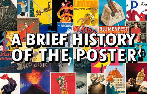
The appearance of the poster has changed continuously over the past two centuries.
The first posters were known as ‘broadsides’ and were used for public and commercial announcements. Printed on one side only using metal type, they were quickly and crudely produced in large quantities. As they were meant to be read at a distance, they required large lettering.
There were a number of negative aspects of large metal type. It was expensive, required a large amount of storage space and was extremely heavy. If a printer did have a collection of large metal type, it was likely that there were not enough letters. So printers did their best by mixing and matching styles.
Commercial pressure for large type was answered with the invention of a system for wood type production. In 1827, Darius Wells invented a special wood drill - the lateral router - capable of cutting letters on wood blocks. The router was used in combination with William Leavenworth’s pantograpn (1834) to create decorative wooden letters of all shapes and sizes. The first posters began to appear, but they had little colour and design; often wooden type was mixed with metal type in a conglomeration of styles.
A major development in poster design was the application of lithography, invented by Alois Senefelder in 1796, which allowed artists to hand-draw letters, opening the field of type design to endless styles. The method involved drawing with a greasy crayon onto finely surfaced Bavarian limestone and offsetting that image onto paper. This direct process captured the artist's true intention; however, the final printed image was in reverse. The images and lettering needed to be drawn backwards, often reflected in a mirror or traced on transfer paper.
As a result of this technical difficulty, the invention of the lithographic process had little impact on posters until the 1860s, when Jules Cheret came up with his ‘three-stone lithographic process’. This gave artists the opportunity to experiment with a wide spectrum of colours.
Although the process was difficult, the result was remarkable, with nuances of colour impossible in other media even to this day. The ability to mix words and images in such an attractive and economical format finally made the lithographic poster a powerful innovation.
Starting in the 1870s, posters became the main vehicle for advertising prior to the magazine era and the dominant means of mass communication in the rapidly growing cities of Europe and America. Yet in the streets of Paris, Milan and Berlin, these artistic prints were so popular that they were stolen off walls almost as soon as they were hung. Cheret, later known as ‘the father of the modern poster’, organised the first exhibition of posters in 1884 and two years later published the first book on poster art. He quickly took advantage of the public interest by arranging for artists to create posters, at a reduced size, that were suitable for in-home display.
Thanks to Cheret. the poster slowly took hold in other countries in the 1890s and came to celebrate each society’s unique cultural institutions: the cafe in France, the opera and fashion in Italy, festivals in Spain, literature in Holland and trade fairs in Germany. The first poster shows were held in Great
Britain and Italy in 1894, Germany in 1896 and Russia in 1897. The most important poster show ever, to many observers, was held in Reims, France, in 1896 and featured an unbelievable 1,690 posters arranged by country.
In the early 20th century, the poster continued to play a large communication role and to go through a range of styles. By the 1950s, however, it had begun to share the spotlight with other media, mainly radio and print. By this time, most posters were printed using the mass production technique of photo offset, which resulted in the familiar dot pattern seen in newspapers and magazines. In addition, the use of photography in posters, begun in Rusia in the twenties, started to becomes as common as illustration.
In the late fifties, a new graphic style that had strong reliance on typographic elements in black and white appeared. The new style came to be known as the International Typographic Style. It made use of a mathematical grid, strict graphic rules and black-and-white photography to provide a clear and logical structure.it became the predominant style in the world in the 1970s and continues to exert its influence today.
It was perfectly suited to the increasingly international post-war marketplace, where there was a strong demand for clarity. This meant that the accessibility of words and symbols had to be taken into account. Corporations wanted international identification, and events such as the Olympics called for universal solutions, which the Typographic Style could provide.
However, the International Typographic Style began to lose its energy in the late 1970s. Many criticised it for being cold, formal and dogmatic.
A young teacher in Basel. Wolfgang Weingart, experimented with the offset printing process to produce posters that appeared complex and chaotic, playful and spontaneous - all in stark contrast to what had gone before. Weingart's liberation of typography was an important foundation for several new styles. These ranged from Memphis and Retro to the advances now being made in computer graphics.


